Selecting the right color palette for your home can completely transform its look and feel. In Central New York, where the seasons bring a dynamic mix of colors and moods, choosing the right hues for your space is even more important. You want colors that not only reflect your personal style but also complement the natural beauty of the region. Whether you’re repainting a single room or revamping your entire home, understanding how to choose the perfect colors will make all the difference.
Consider Central New York’s Seasonal Influence
The changing seasons in Central New York play a major role in how colors appear in your home. Winter’s snow-covered landscapes can make cool tones feel crisp and elegant, while warm hues bring a sense of coziness. Spring and summer bring vibrant greens and floral colors, allowing softer neutrals to shine. In the fall, rich oranges, deep reds, and golden yellows dominate the scenery, making earthy tones an excellent choice for a warm and inviting look.
Think about how your chosen colors will look throughout the year. A soft blue may feel refreshing in summer but could feel too cool in the winter months. Warm grays, creamy whites, and deep greens are versatile options that work well in any season.
Think about how your chosen colors will look throughout the year. A soft blue may feel refreshing in summer but could feel too cool in the winter months. Warm grays, creamy whites, and deep greens are versatile options that work well in any season.
Understand the Impact of Natural Light
Lighting has a major influence on how colors appear in your home. In Central New York, where daylight hours vary between seasons, you’ll want to consider how your home’s lighting changes throughout the year.
Rooms with large windows and southern exposure will receive the most natural light, making colors appear brighter and warmer. Northern-facing rooms often have cooler light, which can make some colors feel darker or muted.
Test paint samples at different times of the day to see how they look in natural and artificial light. A color that appears warm and inviting in the morning may feel different under evening lighting. Soft neutrals and earth tones tend to be more forgiving in a variety of lighting conditions.
Match Your Colors to Your Home’s Architecture
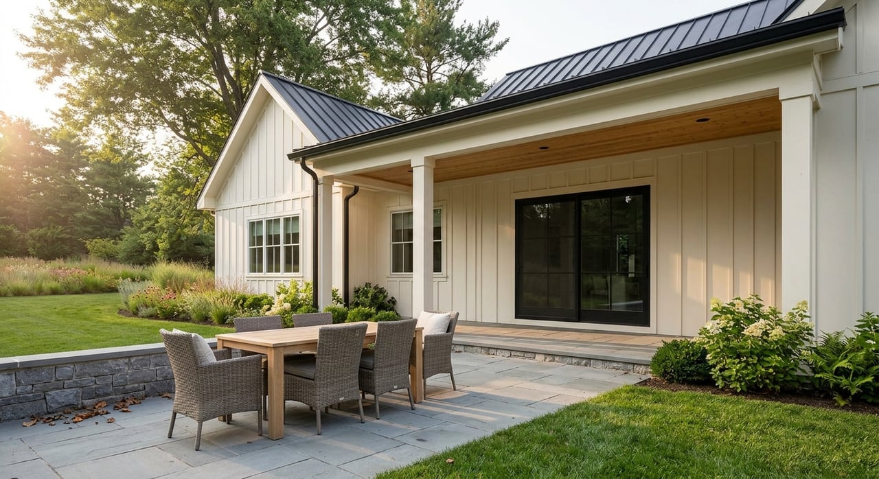
The style of your home should guide your color choices. Traditional homes with historic charm often look best with classic, muted tones, while modern homes can handle bold and contrasting colors. If you have a Colonial-style home, soft whites, deep blues, and warm grays enhance its timeless appeal. A Craftsman-style home benefits from rich greens, earthy browns, and warm terracotta shades. If your home has unique architectural details, use color to highlight them. Accent walls, trim, and doors can stand out beautifully with contrasting shades.
Create a Flowing Color Scheme
Your home should feel cohesive, with colors that flow naturally from room to room. A well-thought-out color palette creates a sense of harmony and balance. One way to achieve this is by using a base neutral throughout the home and then adding accent colors in different rooms. This keeps everything connected while allowing for variety.
Consider using a color palette with a few shades that complement each other. Soft beiges, warm grays, and muted blues work well together, providing a versatile backdrop for furniture and decor. If you prefer bold colors, choose one or two statement shades while keeping the rest of your palette more subdued.
Consider using a color palette with a few shades that complement each other. Soft beiges, warm grays, and muted blues work well together, providing a versatile backdrop for furniture and decor. If you prefer bold colors, choose one or two statement shades while keeping the rest of your palette more subdued.
Think About Mood and Atmosphere
Colors have a psychological effect on mood and energy levels. When choosing a palette, think about how you want each room to feel. Soft blues and greens create a calming atmosphere, making them ideal for bedrooms and bathrooms. Warm tones like deep reds and rich browns add energy and coziness, perfect for living rooms and dining areas.
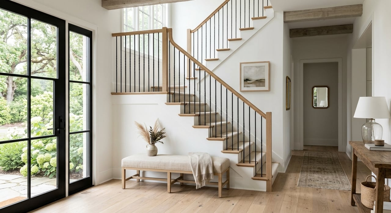
Neutral tones are a great choice if you want a timeless and versatile look. Shades of off-white, beige, and taupe provide a sophisticated backdrop while allowing you to add personality through decor and furnishings. If you’re drawn to vibrant colors, consider using them as accents rather than the primary wall color.
Neutral tones are a great choice if you want a timeless and versatile look. Shades of off-white, beige, and taupe provide a sophisticated backdrop while allowing you to add personality through decor and furnishings. If you’re drawn to vibrant colors, consider using them as accents rather than the primary wall color.
Factor in Your Existing Furniture and Decor
Your home’s furnishings should complement your chosen color palette. Before selecting paint colors, consider the tones of your furniture, flooring, and decor. A room with dark wood furniture may look best with warm neutrals or soft greens, while a space with light, airy furnishings pairs well with cool grays or pastels.
If you have bold-colored furniture or artwork, use neutral wall colors to make those pieces stand out. If your furniture is more neutral, you have the flexibility to introduce color through your walls. Taking inspiration from your existing decor helps create a cohesive, intentional look.
If you have bold-colored furniture or artwork, use neutral wall colors to make those pieces stand out. If your furniture is more neutral, you have the flexibility to introduce color through your walls. Taking inspiration from your existing decor helps create a cohesive, intentional look.
Ultimately, choosing the perfect color palette for your home in Central New York is all about finding the right balance between personal style, natural lighting, and the region’s seasonal changes. By considering how colors interact with your home’s architecture, existing decor, and mood, you can create a space that feels both beautiful and functional.
As your real estate expert, I’m ready to help you achieve your goals in Central New York, whether you’re buying or selling a home in Camillus or Syracuse. Reach out to me, Lori Harrington, for the trusted insight you need.